- Jan 19
Why Seasonal Color Systems Fail Real Clients (and What Works Better)
- Sterling Style Academy
- color analysis course
- 0 comments
Why Seasonal Color Systems Fail Real Clients? In the world of fashion and personal styling, "Seasonal Color Analysis" is everywhere. From viral TikTok filters cycling through "Winter, Spring, Summer, Autumn" to magazine quizzes promising to transform your wardrobe based on your eye color, the allure is undeniable. It sounds scientific. It feels organized. It promises a simple solution to a complex problem: What colors make me look my best?
But for many people, the results fall flat. You might get labeled a "Soft Summer" yet feel washed out in pastels, or be told you're a "Deep Autumn" only to realize those heavy earth tones overwhelm your features.
The reality check is this: While seasonal systems are a popular starting point, they are often not a reliable professional system for real-world styling. Real clients need more than a label; they need a strategy. In this post, we will explore exactly why traditional seasonal color analysis fails so many people and uncover a more precise, professional method that actually works.
What Is Seasonal Color Analysis?
Before we dismantle it, let's briefly define what we are talking about. Seasonal Color Analysis is a method of categorizing people into four distinct groups—Spring, Summer, Autumn, and Winter—based on the coloring of their skin, hair, and eyes.
The origins of this system date back to the early 20th century with color theorists like Johannes Itten, but it hit the mainstream in the 1980s with the explosion of books like Color Me Beautiful. The premise was simple and marketable:
Springs and Autumns have warm undertones.
Summers and Winters have cool undertones.
Stylists are taught to drape clients in specific test fabrics to see which season "clears" the complexion. Because of its simplicity and easy-to-understand categories, it became the gold standard for image consultants for decades. It is viral by nature because it puts people in neat little boxes. But humans are rarely that neat.
Why Seasonal Systems Fail Real Clients
The fundamental issue is that human coloring is a spectrum, not a multiple-choice quiz. When you try to force complex human features into four (or even twelve) rigid categories, accuracy suffers. Here is why the seasonal model often breaks down in practice.
1) Oversimplification of Skin Undertone
The first major stumbling block is the binary view of skin temperature. Seasonal analysis relies heavily on the idea that you are either Warm or Cool.
The Problem: Not everyone fits neatly into "warm vs. cool." A vast number of people have neutral undertones, olive skin, or mixed temperatures (e.g., cool skin with warm overtone, or vice versa).
Real-World Example: Consider a client who is categorized as a "Warm Autumn" because they have some golden highlights in their hair. Under a strict seasonal system, they are told to avoid blue. However, in reality, they might have a neutral-cool skin undertone that looks stunning in deep navy or teal. By forcing them into a "Warm" box, the stylist essentially bans 50% of the color wheel that might actually look great on them.
2) Ignores Depth (Light vs Dark)
Seasons tend to focus heavily on hue (the color itself) but often neglect depth (how light or dark a color is).
For many clients, the lightness or darkness of a color is actually more important than whether it is warm or cool. A "Summer" palette might consist largely of soft, medium-light colors. But if a client has very dark hair and pale skin, they need depth to balance their features. Putting them in soft, powdery Summer colors will make them look faded, even if the "cool" temperature is technically correct. In real wardrobes, mismatching depth is often the primary reason an outfit feels "off."
3) Fails to Account for Contrast
Contrast is the difference in brightness between your hair, skin, and eyes. It is arguably the most critical factor in looking sharp, yet traditional seasonal systems often overlook it.
High Contrast: Black hair, pale skin (needs high contrast outfits, like black and white).
Low Contrast: Medium skin, medium hair (needs tonal, monochromatic outfits).
Two people can technically be "Winters" (cool and clear), but if one has high contrast and the other has medium contrast, they cannot wear the same outfit successfully. A high-contrast Winter looks powerful in a stark black suit with a white shirt. A medium-contrast Winter might look like a floating head in the same outfit because the clothes are wearing them. Seasonal drapes often mislead stylists here because they look at the color in isolation, not how the colors interact with the client's overall intensity.
4) Doesn’t Work Well Across Diverse Skin Tones
It is an uncomfortable but necessary truth: Seasonal systems were originally based on limited archetypes—specifically, Caucasian coloring. The descriptors often used (like "peaches and cream" or "mousey brown hair") simply do not apply to the global majority.
For clients with deeper skin tones, olive complexions, or mixed heritage, the seasonal boundaries blur significantly. A client with deep skin might be automatically categorized as a "Winter" or "Autumn" simply because of the depth of their pigment, ignoring their actual undertone. We see this often where clients are miscategorized due to bias in the draping process, leading to recommendations that dull their natural radiance rather than enhancing it.
5) Relies Too Heavily on Draping (and Draping Can Be Misleading)
Finally, the tool itself can be the problem. Draping is subjective.
Lighting: If a studio has warm lighting, everyone looks like an Autumn.
Texture: A shiny silk drape reflects light differently than a matte cotton drape.
Bias: If a stylist loves blue, they might unconsciously prefer the Summer drapes.
In the age of digital color analysis via Instagram or TikTok, this is even worse. Phone cameras auto-correct white balance, meaning the skin tone you see on screen is rarely the skin tone that exists in real life. Professional analysis requires objective assessment of physical traits, not just a subjective reaction to a piece of fabric.
The Real-World Consequences for Clients
When seasonal color analysis fails, the client pays the price—both financially and emotionally.
Restriction over Empowerment: Clients leave appointments with a "wallet card" of 30 swatches and a fear of buying anything else. They stop trusting their own eyes.
Avoidance of Flattering Colors: By adhering to a rigid season, clients avoid colors that actually suit them. A "Spring" might avoid black for their entire life, even if they have the contrast to pull it off.
Wasted Wardrobes: Clients purge clothes that were perfectly fine and buy new items that theoretically fit their "season" but don't fit their personal style or contrast level.
Loss of Credibility: When a client buys the recommended colors and doesn't receive compliments—or worse, feels frumpy—they lose faith in styling as a profession.
What Professional Color Analysis Should Actually Do
If seasons are too simple, what is the solution? A professional methodology moves beyond labels and looks at the physics of color relative to the individual. This is where approaches like the Sterling methodology distinguish themselves from hobbyist systems.
Focus on Color Qualities, Not Seasons
Instead of asking "Are you a Summer?", a professional asks: "Where do you sit on the three dimensions of color?"
Undertone (Temperature): A spectrum ranging from very cool to neutral to very warm.
Chroma (Intensity): Can you handle bright, clear colors, or do you need muted, soft colors?
Value (Depth): Do you shine in light colors, or do you need deep, rich tones to anchor your look?
By analyzing these qualities separately, we get a precise prescription. You might be Cool + Deep + Muted. That is far more specific and helpful than "Summer."
Look at the Whole Person, Not Just Skin
Effective analysis considers the interplay of all features.
Hair Depth: Does your hair demand a darker color near the face?
Eye Color: Do your eyes add a "sparkle" that allows for brighter accent colors?
Personal Contrast Level: This dictates how you combine colors. A professional teaches you not just which colors to wear, but how to wear them together (e.g., pairing a light top with dark trousers vs. wearing a monochromatic look).
Give Clients Principles They Can Use Forever
The goal isn't to give a client a fish; it's to teach them to fish. A professional analysis provides principles.
"You need cool colors, but keep them medium-depth."
"You can wear warm colors if they are in a lower half of your outfit."
This allows clients to walk into any brand, any store, in any trend cycle, and make it work. It adapts to fashion, whereas seasons often fight against it.
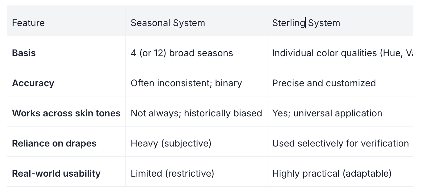
Seasonal vs Sterling Color Analysis — Side-by-Side Comparison
When (If Ever) Seasonal Color Analysis Can Be Useful
We aren't saying seasons are useless. They serve a purpose. They are an excellent entry point for beginners. If you have never thought about color before, learning you are a "Winter" is a fun, digestible way to start paying attention to your wardrobe.
It works well as a fun styling framework, similar to horoscopes. It gives you a tribe and a general idea. However, for a high-stakes wardrobe, a personal brand, or a professional image overhaul, it should never be the final answer. It is a sketch, not a blueprint.
A Better Way to Think About Color
If there is one takeaway here, it is this: Color is about harmony, not categories.
Precision beats labels every time. When you understand the why behind what works—why that emerald green makes your eyes pop, or why that beige makes you look tired—you gain control over your image. You stop being a slave to a swatch book and start making strategic styling decisions.
If you have tried seasonal analysis and felt like something was missing, you weren't wrong. You likely just didn't fit into the box.
If you want a more accurate, real-world approach to color, look for methods that assess undertone, depth, and contrast—not just seasons.
Upcoming Courses
If you’re interested in mastering professional color analysis, join us at one of our upcoming trainings:
New York City: January 31 – February 1
Register for NYC Color Analysis TrainingMiami: February 7 - 8
Register for Miami Color Analysis TrainingWashington DC: February 14 – 15
Register for DC Color Analysis TrainingDallas: February 21 – 22
Register for Dallas Color Analysis Training