- Jan 16, 2025
Comparison Guide: Deep Autumn, Deep Winter, and Bright Winter
- Sterling Style Academy
- color analysis course
- 0 comments
Understanding the nuances between Deep Autumn, Deep Winter, and Bright Winter in seasonal color analysis can be tricky, but knowing their key physical characteristics can help. Here’s a breakdown of the differences and similarities:
Deep Autumn
Skin Tone:
Warm, rich undertones with strong golden or bronze hues.
Can range from light beige to medium or deep golden brown.
May have olive skin tones with warm undertones.
Hair Color:
Dark and warm shades. Think deep brown, chestnut, or dark auburn.
Hair often carries a golden or reddish sheen under bright light.
Eye Color:
Eyes are typically warm, such as rich brown, hazel, or green with gold flecks.
The overall eye color is deep and warm, blending harmoniously into the skin and hair.
Key Traits:
Warmth dominates; features are rich, earthy, and harmonious.
Colors that flatter include warm, deep, and muted tones like moss green, rust, and deep teal.
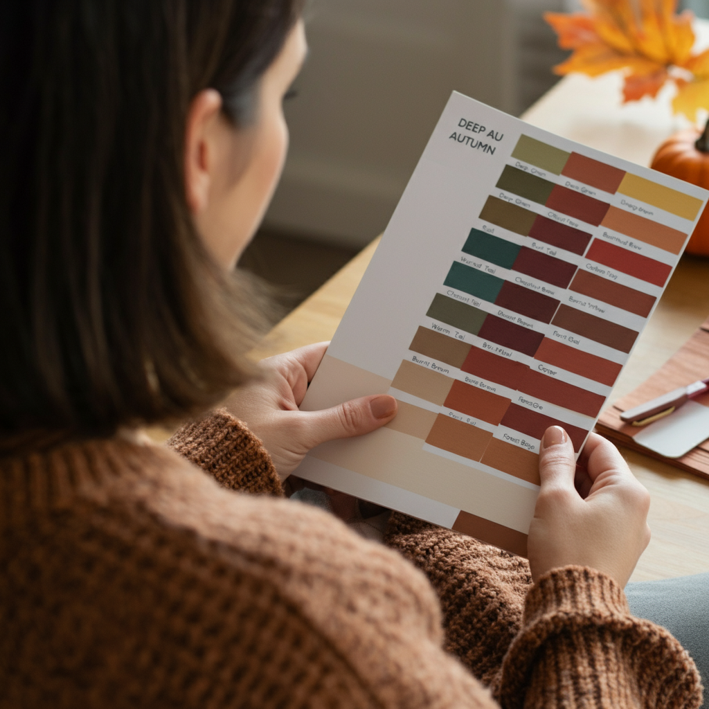
Note: This image has been included for illustrative purposes but the names of the colors do not correspond to the colors on this palette.
Deep Autumn Color Palette
A Deep Autumn palette is rich, warm, and earthy, with deep shades that bring out the warmth in this season. Here’s a look at the colors typically found in this palette:
Deep Olive Green: A warm, muted green that feels grounded and earthy.
Rust: A burnt orange shade with a strong warm undertone.
Chestnut Brown: A rich brown with red or golden warmth, perfect for adding depth.
Burgundy: Deep, warm red with a subtle earthy tone.
Mustard Yellow: A rich, golden yellow, not too bright, but full of warmth.
Warm Teal: A muted teal with a blend of green and blue, leaning warm.
Copper: A metallic or burnt orange-brown shade that adds shimmer yet feels natural.
Espresso Brown: A deep, almost black warm brown that grounds the palette.
Brick Red: A muted, earthy red with orange undertones, ideal for pops of color.
Burnt Sienna: A warm, earthy orange-brown perfect for balance.
Golden Beige: A soft, muted beige that leans toward gold for a warm neutral.
Forest Green: A dark, warm-toned green reminiscent of evergreen trees.
These colors align beautifully with the natural warmth and depth of Deep Autumns, creating harmony and sophistication in both fashion and design applications.
Deep Winter
Skin Tone:
Cool with blue or pink undertones. Some deep winters can have olive skin, but with a cool, ashy undertone.
Ranges from fair with coolness to deep, dark skin tones with no warmth present.
Hair Color:
Hair is deep and cool—think jet black, dark ash brown, or black-brown with no hint of warmth.
Less likely to have red or golden undertones in the hair compared to Deep Autumn.
Eye Color:
Deep and striking, with colors like dark brown, black-brown, icy blue, or deep gray.
Eyes often have a sharp, contrasting look due to the cool tones.
Key Traits:
Coolness and depth define this season. Features lean toward high contrast and striking clarity.
Best suited for cool, deep colors like navy, true red, charcoal, and icy tones.
Deep Winter Color Palette
A Deep Winter palette is dramatic, cool, and full of striking contrasts. It features bold, rich tones balanced by icy shades. Here’s a look at the colors typically found in this palette:
Jet Black: A true, deep black that creates sharp contrast and adds drama.
True White: A crisp, stark white with no hint of warmth, perfect for balance.
Icy Blue: A pale, frosty blue that feels cool and fresh.
True Red: A bold red with cool undertones, adding energy and vibrance.
Royal Purple: A deep, cool purple with hints of blue, creating regal boldness.
Charcoal Gray: A dark, cool-toned gray that’s softer than black but still striking.
Cool Teal: A deep teal with a blue-green mix that leans towards cool tones.
Emerald Green: A vivid, cool green that makes a statement.
Navy Blue: A deep, almost-black blue that’s dramatic and versatile.
Hot Pink: A bold, blue-based pink that feels vibrant and modern.
Midnight Blue: A darker-than-navy shade, evoking a cool, inky night sky.
Silver: A cool metallic that adds an icy sparkle to the palette.
These colors emphasize the strong contrasts and cool undertones characteristic of Deep Winter, offering a vibrant and striking visual harmony in clothing or design.
Bright Winter
Skin Tone:
Cool undertones dominate, but skin often has more brightness or clarity than Deep Winter.
Can range from fair with porcelain tones to medium with a cool, clear appearance.
Hair Color:
High contrast between hair and skin is common. Hair is typically cool, like deep black, dark brown, or occasionally icy dark blonde.
The hair always has a smooth, cool tone with no golden warmth.
Eye Color:
Clear and vibrant eyes are a hallmark. Colors include icy blue, bright green, sharp gray, or even a striking dark brown.
Eyes tend to sparkle and stand out against the skin.
Key Traits:
Features are high-contrast but bright and crisp, unlike the depth of Deep Winter.
Best for vibrant cool tones like fuchsia, cobalt, true white, and icy pastels.
Bright Winter Color Palette
The Bright Winter palette is lively, crisp, and full of striking contrasts. These colors are clear and vibrant, with cool undertones that highlight the brightness and clarity typical of this season. Here’s a look at the colors found in this palette:
Icy Pink - A light, frosty pink with a cool undertone for a playful yet elegant touch.
Electric Blue - A bold and energizing blue that’s vibrant and crystal-clear.
Bright White - Pure, clean, and stark, perfect for high-contrast pairings.
Cherry Red - A vivid red with cool undertones, offering a pop of brightness.
Cobalt Blue - A deep yet bright blue that feels sharp and sophisticated.
Cool Mint - A refreshing, pastel green with a crisp clarity.
Bright Turquoise - A striking blend of blue and green that’s vivid and eye-catching.
Jet Black - A deep, strong black to ground and contrast with the brighter tones.
Silver - A sleek, metallic color with a cool shimmer.
Bright Violet - A stunning purple with a cool and intense brilliance.
Hot Pink - A daring and ultra-bright pink with cool undertones.
Light Lemon Yellow - A sharp, clear yellow for a cheerful pop of color.
These colors embody the luminous and energetic qualities of Bright Winter, offering a palette that’s perfect for bold, high-contrast looks in both fashion and design.
Summary of Differences
Warmth vs. Coolness: Deep Autumn leans warm with earthy richness, while Deep Winter and Bright Winter both lean cool, but Bright Winter has a clearer, more radiant tone.
Depth vs. Brightness: Deep Autumn and Deep Winter are defined by their depth, whereas Bright Winter has more brightness and vibrancy in its features.
Eye Color: Autumn eyes are warmer and softer, Winter eyes are cool, with Bright Winter being clearer and more radiant.
Hair Color: Autumn hair often has warmth (like red or gold), but Winter hair is always ashier or cooler in tone.
By understanding these nuances, you can better differentiate these seasonal types and discover your best palette!
Are you finding the 12 seasonal color analysis method confusing or inconsistent? If discrepancies in your categorizations are leaving you frustrated, it’s time to explore a better, clearer solution. The Sterling Color Quality Method offers a fresh, precise approach to color analysis that prioritizes accuracy and simplicity. Take your understanding of color to the next level with expert training designed to help you achieve consistent results.
Discover the difference for yourself—start today at Sterling Color Quality Method! Transform how you see and analyze color with confidence! 🎨✨