- Jun 24, 2025
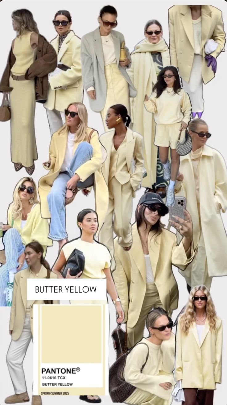
Butter Yellow is Trending This Spring/Summer 2025
- Sterling Style Academy
- color analysis course
- 0 comments
Color trends come and go, but every so often, a shade takes center stage and refuses to be ignored. For Spring/Summer 2025, that shade is Butter Yellow. Sunny, soft, and versatile, it’s quickly establishing itself as a favorite across fashion and design spaces. Pinterest searches confirm what we’re seeing on runways and inspired Instagram feeds alike—but with its rising popularity, there's been an interesting debate brewing.
Is Butter Yellow truly its own distinct color, or is it just a rebranding of the well-known pastel yellow? And if so, does that mean it leans warm or cool? These are the kinds of subtle nuances in color analysis that the Sterling Style Academy’s Sterling Color Quality System can help you unravel. Here’s what you need to know about Butter Yellow, why it’s trending, and how sharpening your eye for color can elevate your styling expertise.
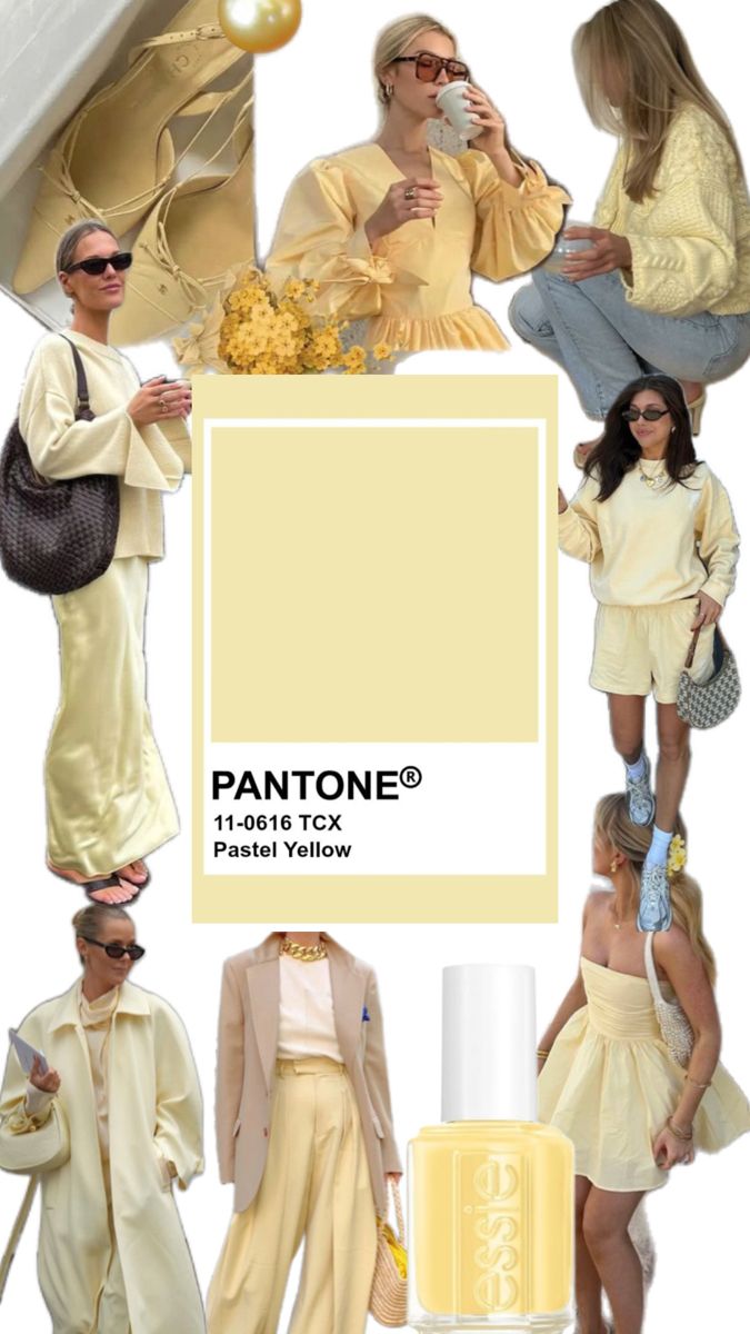
Image Sources: Pinterest
Butter Yellow or Pastel Yellow?
A quick search for Butter Yellow on Pinterest reveals a range of soft, pale yellows that blur the line between pastel and creamy tones. While some call it Butter Yellow, it shares striking similarities with what we traditionally know as pastel yellow. The confusion lies in how the industry redefines and markets color names, especially in fashion.
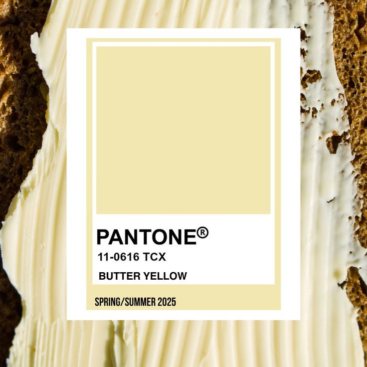
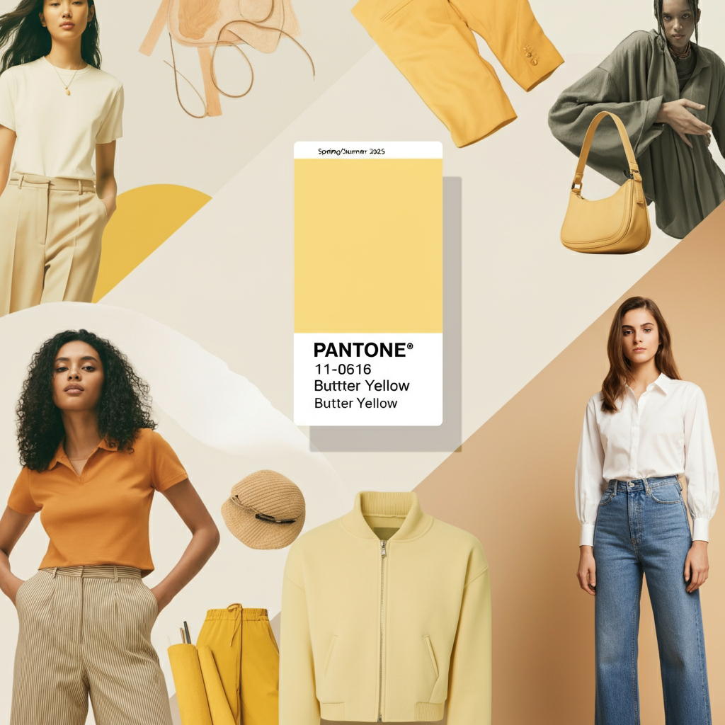
Is Butter Yellow an official Pantone shade? Yes! The Pantone shade 11-0616 TCX, labeled as “Butter Yellow,” has been trending for Spring/Summer 2025, highlighting its influence as a seasonal favorite. However, pastel yellow and Butter Yellow are often interchangeable in online inspirations, creating inconsistency when identifying what actually defines this hue.
Warm or Cool Undertones? The answer depends on the specific shade of yellow you're working with. While Butter Yellow is often depicted as warm, creamy, and golden compared to the icy undertones of some pastel yellows, the reality is that both warm- and cool-leaning versions exist. Lighter shades with more white or blue undertones tend to feel cooler, while versions with hints of cream or orange are distinctly warmer.
Color names, though helpful, don’t capture the full story of a shade, especially since lighting and surrounding hues can alter perception. This exact complexity is why Sterling Style Academy focuses on teaching students to identify a color’s hue, value, and chroma instead of relying merely on its name.
Breaking Down Butter Yellow Using Munsell’s Color Theory
At the Sterling Style Academy, we take our cue from Munsell’s Color Theory to help students analyze color more accurately and confidently. This time-tested system moves beyond names like Butter Yellow or Pastel Yellow and dives into the core components that define color:
Hue: Refers to the type of color itself—in this case, variations of yellow.
Value: Describes how light or dark the color is. Butter Yellow typically has a high value, leaning lighter on the spectrum.
Chroma: Indicates the purity or intensity of the color. Butter Yellow tends to have a muted chroma, giving it its softness and subtlety.
Using these principles, you’ll learn to recognize the difference between one “Butter Yellow” and the next, as well as determine whether it’s suited for someone with warm or cool undertones. This skill is invaluable in personal styling and image consulting because it allows you to bring precision and insight into your recommendations.
Why Training Your Eye Matters
Color analysis is about more than assigning a single name to a shade. A trained eye can pick up on subtle differences in undertones, brightness, and intensity that make all the difference in elevating a look. For instance, Butter Yellow can work beautifully in soft, warm palettes with olive greens and terracotta tones, but a cooler version pairs just as well with slate blues and dusty lavenders.
If you're wondering how to refine your own ability to identify color nuances, here’s where the Sterling Color Quality System excels. Our program teaches you to strip away the reliance on generic color terminology and instead focus on mastering the foundational elements of hue, value, and chroma so that you can independently and accurately analyze every shade.
Which outfit is really butter yellow? And do you have to go by the Pantone color? Do all the hues of butter yellow look the same above from Pantone to outfit selection?
Why We Teach You to Create Your Own Drapes
When learning color analysis, having the right tools is critical to success. However, at Sterling Style Academy, we caution against using standard, pre-made drape kits. Many of the drapes on the market today are inconsistently produced and do not adhere to strict standards, which can lead to inaccurate results.
Instead, we teach you how to customize your own drape sets based on the principles of Munsell’s Color Theory. With this approach, not only do you gain hands-on experience in color matching, but you also ensure that your materials are tailored to the highest standards. This process is central to the Sterling Color Quality System, helping you stand out as a knowledgeable and effective color analyst.
Butter Yellow in Styling
Butter Yellow’s versatility makes it a standout choice for Spring/Summer 2025. Whether styled as a monochromatic statement or incorporated as a gentle pop of color, it can be a game changer for wardrobes. Consider these combinations for inspiration:
Warm Butter: A creamy Butter Yellow blazer paired with off-white trousers and camel-toned loafers creates a polished, sophisticated look.
Cool Butter: Incorporate cooler Butter Yellow in a dress and layer it with a muted denim jacket for contrast, or team it with slate gray accessories for a balanced touch.
For personal styling professionals, learning how to seamlessly integrate trending colors like this into your clients' wardrobes is essential. By mastering the Sterling Color Quality System, you’ll have the skills to make tailored, impactful choices that elevate your work.
Take Your Expertise Further with Sterling Style Academy
If you’re excited about color trends like Butter Yellow and want to deepen your knowledge of color theory, personal styling, and image consulting, it’s time to level up your expertise. At Sterling Style Academy, we offer both in-person and online courses to fit your learning style!
Upcoming Training Programs
Take advantage of our hands-on, interactive in-person color analysis classes:
Miami Color Analysis Training - June 28–29, 2025
Bangkok Color Analysis Training - July 4–5, 2025
Singapore Color Analysis Training - July 8–9, 2025
Miami Color Analysis Training - July 26–27, 2025
Dubai Color Analysis Training - August 2–3, 2025
New York Color Analysis Training - August 16–17, 2025
San Francisco Color Analysis Training - September 18–19, 2025
Prefer to learn online? Our Online Color Analysis Training Program covers everything you need to know, including an interactive component after completing your homework assignments. Learn more here and enroll today: Online Color Analysis Training.
Final Thoughts
Butter Yellow is undoubtedly one of the defining colors of Spring/Summer 2025. Its ability to range from warm and golden to cool and airy makes it versatile, approachable, and exciting. However, interpreting these nuances correctly and applying them with precision in styling requires more than just an eye for trends.
With the Sterling Color Quality System and Munsell’s Color Theory as your foundation, you’ll not only explore the complexity of Butter Yellow but also master the skills to analyze and apply any color with confidence. Join us in person or online to refine your expertise, expand your skills, and elevate your professional offerings.
Start your training today and become the authority your clients can trust!