- Nov 12, 2025
Behind the Scenes: How Pro Stylists Use Color Analysis in Real Client Sessions
- Sterling Style Academy
- color analysis course
- 0 comments
Case Studies, Before/After Insights, and What Actually Happens in the Chair
Professional color analysts use structured draping, undertone mapping, and wardrobe strategy to identify a client’s best colors. Real case studies show how color analysis can transform confidence, influence purchasing behavior, and correct years of styling mistakes.
Why This Blog Matters
Most people imagine color analysis as “holding up some drapes and picking a season.”
Real professionals know it is a precision-based consultation that changes:
✅ How a client shops
✅ What they stop buying
✅ Their brand image
✅ Their confidence
✅ Their daily decision-making
Here is what truly happens behind the scenes with real clients—featuring insights from the Sterling Style Academy methodology used by image consultants and color analysts around the world.
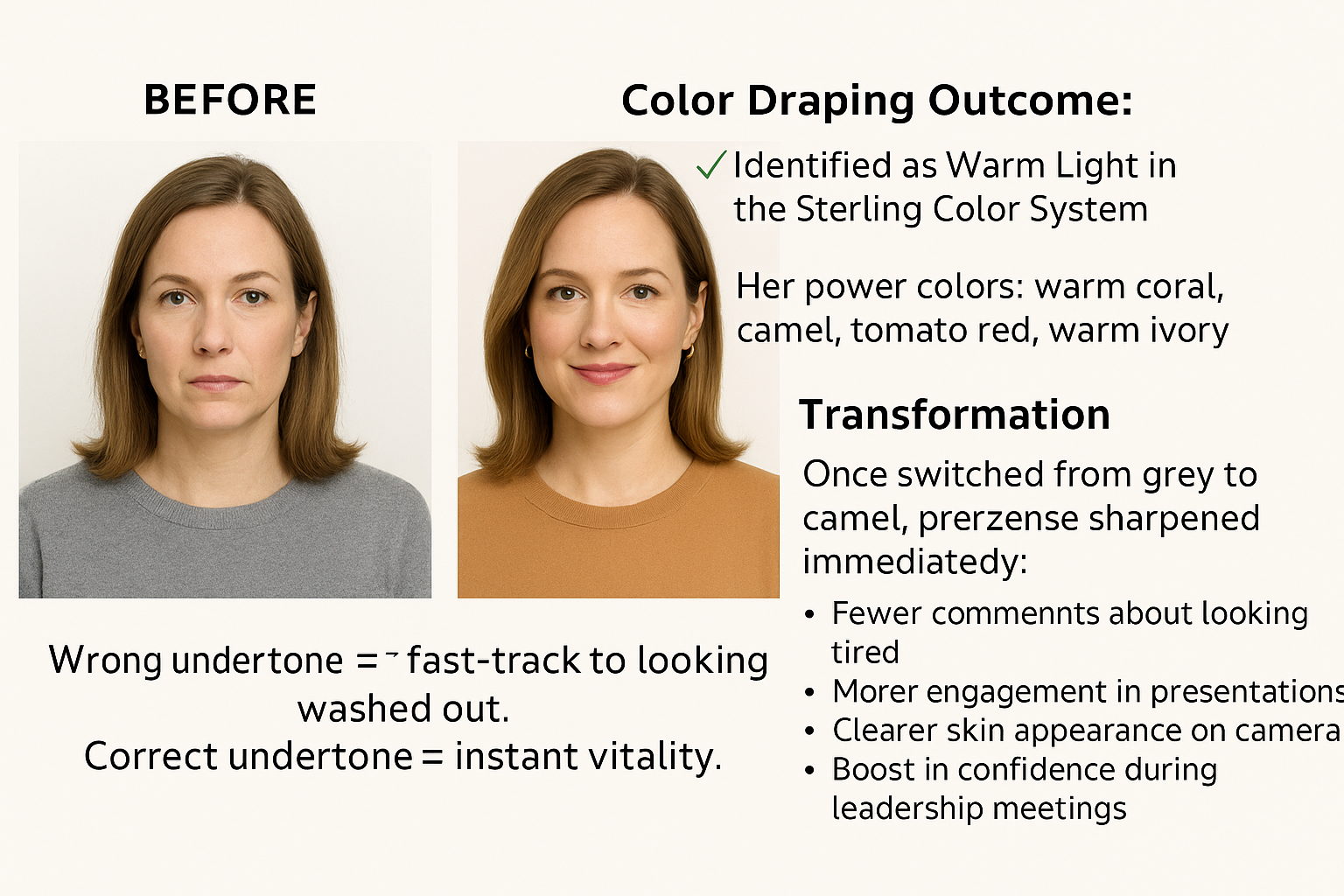
Case Study 1: The Executive Who Looked “Tired” on Zoom
Client Challenge:
A 42-year-old corporate executive said her team constantly asked if she was tired—even when she wasn’t.
Behind the Scenes: What We Noticed
Her wardrobe contained muted taupes and cool greys
Her natural undertone was warm-neutral, but she always gravitated toward cool tones
Her makeup had ashy bronzers, washing out her face
Color Draping Outcome:
✅ Identified as Warm Light in the Sterling Color System
✅ Her power colors: warm coral, camel, tomato red, warm ivory
Transformation:
Once she switched from grey to camel, her Zoom presence sharpened immediately:
Fewer comments about looking tired
More engagement in presentations
Clearer skin appearance on camera
Boost in confidence during leadership meetings
Takeaway:
Wrong undertone = fast-track to looking washed out.
Correct undertone = instant vitality.
Case Study 2: The Entrepreneur “Afraid of Color”
Client Challenge:
A 35-year-old entrepreneur wore only black for branding photos, social media, and daily life.
Behind the Scenes: Red Flags
She believed color made her look “bigger”
Her brand photos felt flat and uninviting
She wanted to soft-launch premium services but didn’t look “premium”
Color Analysis Findings:
✅ She was a Soft Summer Neutral — cool, soft, and elegant
✅ Black was overpowering her softness
✅ Her true power palette included: dusty rose, slate blue, soft plum, mist grey
Transformation:
New photos in dusty rose and slate blue
Immediate increase in brand engagement
Clients described her as “warm, trustworthy, refined”
She began attracting higher-quality customers
Takeaway:
Black is not a personality. And it is not a universal strategy.
Color analysis removes emotional bias and replaces it with data-driven clarity.
Case Study 3: The High-Net-Worth Client With a Closet Full of Designer Mistakes
Client Challenge:
A successful client in Dubai had 40+ designer pieces she never wore because they “didn’t look right.”
Behind the Scenes: What We Saw in the Draping Session
She was wearing high-contrast prints
Her natural tone was Warm & Muted (think golden, soft, earthy)
She kept buying cool, icy designer tones because they looked good on models—not her
Color Analysis Discovery:
✅ Her best palette: Warm Autumn Luxe
✅ Gold jewelry over silver
✅ Her true power colors: olive, rust, cinnamon, warm teal, honey gold
Transformation:
She consigned the pieces that didn’t suit her
Replaced them with strategic buys in her palette
Her entire wardrobe now worked together
She said: “I finally look expensive — not just dressed expensively.”
Takeaway:
Color is the quickest path to visual luxury.
When your palette is correct, even simple outfits look high-end.
Case Study 4: The Public Speaker Getting Washed Out on Stage
Client Challenge:
A motivational speaker felt small on large stages.
Lighting made her face look flat.
Behind the Scenes Observations:
Stage lighting tends to be:
Harsh
Cool
Unforgiving
During draping, we discovered:
✅ She was High Contrast Cool Winter
✅ Jewel tones made her pop under lights
✅ Her ideal stage colors: royal blue, emerald, magenta, sharp white
Transformation:
She wore a royal blue structured dress to her next event
The audience reported she looked “electric”
Photos and video content skyrocketed in visual impact
She booked three more speaking engagements from that event
Takeaway:
Color has a literal ROI.
It affects visibility, presence, and perceived authority.
How a Real Color Analysis Session Actually Works
Clients often think it’s random.
Professionals know it’s a structured process.
✅ Step 1 — Undertone Identification
Warm, cool, or neutral?
This determines 80% of the analysis.
✅ Step 2 — Depth Level
Light, medium, or deep?
This reveals ideal contrast levels.
✅ Step 3 — Clarity vs Softness
Bright and crisp—or soft and blended?
This decides how bold or muted your palette should be.
✅ Step 4 — Precision Draping
Professional drapes remove emotional bias.
We evaluate:
Skin clarity
Eye brightness
Facial symmetry
Shadow patterns
✅ Step 5 — Translation Into Wardrobe Strategy
This is where the real transformation happens:
Shopping lists
Makeup shades
Jewelry metals
Signature colors
Power colors
What to avoid
✅ Step 6 — Digital Color Guides
Clients receive:
A digital palette
Brand color guidance (if needed)
Recommendations for photoshoots, Zoom, stage, lifestyle
Why These Results Are Repeatable
Because certified image consultants and color analysts are trained in a system, not guesswork.
Your clients don’t just get “pretty colors.”
They get identity, clarity, consistency, and a lifetime strategy.
Want to Learn How to Do This as a Professional?
If you want to become the image consultant, color analyst, or personal stylist people trust, remember, and pay premium rates for…
📌 Enroll in the Sterling Style Academy Online Image Consultant and Personal Stylist Certification
Or start with the focused option:
📌 Online Color Analysis Training
You’ll learn:
Undertone mastery
The Sterling Color Quality System
Real client case studies
How to build your business
How to market color analysis for high-paying clients
Become the expert clients never forget.